Pinterest

Sunday, June 4, 2017

Hello and welcome to Moon Dog.
This video will start at the main menu and we'll make our way through all the floors in the house as I provide some commentary on the game and what's going on with the small team behind it as well as myself.

Accompanying video here:


I'll take a second to talk about the awkward controls. It uses the classic tank controls, but with the camera of a first person system, the camera actually pivots around like your face would, this is to help make a more immersive experience and what I think will be a nice twist on the classic Resident Evil style without just making it an "FPS". As I walk into the house, I want to clarify that this is a stripped down look at the house, you won't see any furniture or items besides the candles, which you'll notice aren't very good at lighting up the dark house. You can see that the floor, ceiling, and walls have a texture, but nothing else will, and what is there is just a placeholder, once the programming gets farther along I'll be going back to . Now then, this small demo of Moondog takes place in a medieval time somewhere in Europe, this demo will put you in the shoes of a Moondog here to explore the house, find a treasured stone, and return to your employer. The stone is an ancient relic, but you'll learn more about that at a later time. In this world, a Moondog is a member of an underground society that steal from people of fame or interest. This house belongs to a lord who has shut himself up in the woods away from town, but rumors say he's actually guarding something and the moondogs quickly took action to find out what it was. One of your members already set out to find it, but without hearing back from him, the society sent you in to investigate his dissapearance as well as finish what he started.


More on controls: This game is using a tank control scheme for your body, but you can look around and almost behind you thanks to the camera pivoting like your head would. It might look a bit clunky right now with the slow turning and slow walking pace but we're working on revamping the controls, movement, and getting the main character in, who I'll be able to reveal in a future update. This game will focus on exploring the house and
getting immersed in the atmosphere, but of course there will be puzzles, item hunting, and a little bit of combat to break it up. The main demo will use this layout for the house and the main goal will be getting into all the locked doors, once you do that, you'll have to wait for the full game to see what the last door was hiding. As we go up I'll start talking about the timeline of the game.


This game is my attempt at creating a new way of thinking about an FPS game inspired by the VR headsets I worked with. This project is piggy backing off a previous project that was an attempt at coding a game in a month from scratch. Obviously that didn't work out too well but it's come a long way and kept inspiration from it. This demo is planning to be released around October of this year as a prequel to another project and as such is much grander in scope and will have more time put in as compared to the previous which was going to be something more of an arcade style zombie shooter. I want to emphasize the idea of this being a crash course in the control scheme, with weapons being more melee oriented and animation based rather than working with something that requires precise aim when players might not be comfortable with the controls yet. Things are fairly slow in this, and won't pick up to anything too intense until part 2 is started, where it can afford to be more action packed. We're reaching the end of our tour so I'd like to take some time to say that this first part is going to be free when it's released, and probably won't take long to complete. Part 2 is going to dabble in some different themes, have more enemy types, more puzzles, and will expand upon the story that encompasses the world these games take place in; that game will be for sale to help support the people helping me as well as myself so we can keep working on things like this, there's no price planned yet.


I'm not a fan of making any solid dates as things happen, problems come up, and a small team can easily hit a wall in terms of development, but I will be pushing for October from a small team as a lead and try to make some more videos showing major milestones like this. This will be my first game in what I hope can broaden out to a small series of related games, so I want to thank you first for making it this far, and for showing interest. Look forward to the release of moon dog, and more videos later on, see ya.
Tuesday, May 2, 2017

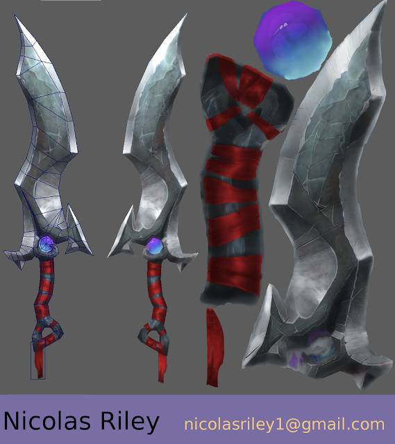
pugui Rock Sword


Been sitting on this for too long so I decided to clean it up and get it out there. Because I decided to "do my own thing" and create an all new texture I focused on just the rock part of it and I think it's not bad for my own thing but I can't help to think that I ruined it in a way.

Time to move along though and focus on something else. Here's a sketchfab if you want to get a look at the model itself.

Wednesday, April 12, 2017

Hand Painted Sword WIP 1

At this point I'm moving along with shadows and working on giving everything a rock texture, taking a break as I block in where my major highlights are. A little too blue right now and not enough shadow but it's a start!


Monday, September 5, 2016

Nene and Clarion

Friend wanted a model for Tabletop Simulator and gave me this image:


And this is what I came up with:


Don't look up her skirt.

Thursday, July 7, 2016

Month 3 Final

(Almost done, post here: Beauty in Decay)

(This might be a little strange, but here's what Month 3 looked like back in Month 0)

No, before you ask you are seeing right, this is not a white N64 controller, this is nothing at all like a N64 controller. Somewhere along the way I got it in my head to do an environment instead of a prop again, so I chose this at the last possible second and began work. HO LEE HECK was this a crazy challenge to do in a month for me. In terms of models there are very few, a door, a chair, a weird thing propped against the wall, but the level layout in Unreal gave me no end of problems. Foliage alone would have taken me a month to figure out let alone figure out while getting this thing modeled and put together in time. Had I done this with a blockout like the rest I think it would have looked a lot closer to the reference, but I don't think I did too bad. Enough rambling though, here it is.


You know the drill.

So what are you looking at here, well it's pretty simple actually, just a hallway of a random mental hospital somewhere in the UK. Fun fact I was going to recycle this hallway into the ArtStation challenge that was going on at the time but school + Challenge really don't mix well, especially for someone who doesn't know the ropes that well yet. Lets talk environment workflow.

Build pieces and get idea of placement in Maya
--> Export/Import pieces into UE4
--> Figure out placing, camera, early lighting
--> Tweak the post processing
--> Add lights, particles, etc. for the final look

Lots of ups and downs with an environment in my opinion. I enjoy the process of making and placing everything where it needs to be, learned a lot about UV's for this stuff here, the hard part comes from getting it all to work out together. That being said, it isn't what I spent most of my time on, all of time went to figuring out Foliage and Lighting. (foliage was abandoned as you can see in the photo) The light in the reference is "impossible" to achieve with natural lighting, so I changed it to be natural and added some light rays and particle effects to spice it up. Looking back it might seem like a cheap way to make it look "good" but for a hallway done in a month I didn't really have time for something fancier. If only it got a blockout month, I guess. Walls could use a new material, maybe wood or something?

Month 2 Final

(Again, you can see the pictures and such here: Mateba MTR-8)

(If you forgot what this looked like back in Month 0, look here!)

I like guns, I like guns that are really weird, I like guns that are a pain to model, and would you look at that this one checks off all the boxes. Mateba MTR-8, a sport gun that was made for shooting at stationary targets on a field quickly. You could also use it to shoot at people but you'd probably have a harder time with that, especially if you miss. With 8 shots you have a little bit of leeway though so maybe it's not too bad, has this been used in a game/war though? I doubt it, hell I haven't seen much of this gun at all in the 3D world, just a few projects for early artists like me. Enough rambling though here's some Sketchfab links


Now don't tell anyone this, but this was actually the concept for how guns would look in a game I've been mulling over in my head for a while now, and I decided to go for it, but I don't think it worked out too well.


Anyway, there's a lot to be learned from this project the next time I do a gun, maybe in the material work, maybe in the presentation, maybe in the modeling. Nevertheless this is a cool revolver that I loved to look at, and that I want to come back to later for some rigging and animation work. Here's some pictures from the art station.


Click or RMB+View Image or whatever to see them in their full size.

Here's my workflow for hard surface objects at this time

Maya for base mesh and placement
--> Edge Loops for shape and then smoothing for high poly
--> Substance Painter for baking and texturing

Wow so simple, how was this not done in 2 days? Because I am an idiot and wanted to go an extra mile or two with my modeling, leading to the third shot you see there with everything torn apart. This means that you can pull my model apart piece by piece and render it all out from any angle, something that I decided sort of last minute and then spent a lot of time figuring out. That being said there are a few things missing since it was made for that last shot, not being pulled apart accurately since this is just a prop and would never be pulled apart like that for any reason, it's just pretty to look at.

Zbrush has a new modeling application with r7 I want to say, my friends tell me it would make my hard surface modeling much better but I frankly have very little experience with Zbrush at the moment. I may have to entertain the idea of using Zbrush exclusively for a new gun at some point. Oh, to dream about future projects.

That's about it for this one, there are comment sections and chat programs for any questions there are about this. Let's move on to the last month.

Month 1 Final

(You can find the pictures and such here as well: Leather Camera Bag)

(If you forgot what this looked like back in Month 0, look over here!)

My teachers always told me that simple is better, and really this proved it to me. My most popular final by a landslide, here is a small camera bag that I found online:

Sketchfab:

In terms of the amount of work put in, I guess this might seem like I did the most here with the insides and zippers there, but honestly I think the Mateba was a lot more actual hours. That's why you do simple things, a little work goes a long way with them whereas a more complicated piece will take 5x the hours to look just as good! I'm a believer but I don't listen well, I need to experience it myself. Enough rambling though, here are some pictures.


Make sure to click on these or RMB+View Image or whatever to see them in their full size.


This was simple, and I liked it, and people liked it and yadda yadda yadda. Maybe I should do some more small props like this, could be funner than working hard. I don't really have any thoughts to share on this one, the process was fairly simple so I'll go over it really quick.

This is my general workflow for organics at the moment:
Maya Base Mesh and placement
--> Zbrush the main parts that need it, pushing and pulling it as it needs to be pushed and pulled
--> Back into Maya for remeshing, which is thankfully very easy since I can export the base mesh I made in Maya that has all the Zbrush work done on it
--> Staying in Maya where I remesh anything that needs to be done manually
--> Substance Painter/Designer for the materials

Originally the sewing pattern was done in Zbrush because lolhighpoly but I was advised to do it in Substance Painter instead which worked out a lot better once I got it configured correctly. The sculpting work on this was actually really simple, just a little stressing and masking + pushing and pulling. The majority of the work on this was done in Maya, the base mesh having pretty much everything except a lot of polys. Although the workflow is pretty straight forward, I actually jump back and forth a lot between each step, tweaking and adding things as they come up. Through out all 3 months I always told myself I need to make sure I'm seeing potential problems immediately but sometimes it's impossible when you have a deadline sitting on your back and tunnel vision guiding you along. That's all for this, lets move on to Month 2.